Get started by: Creating a website → | Getting a domain →

Website design has come a long way since the dawn of the internet. With the development of technology, the use of tools like a drag and drop website builder, AI and the online opportunities that follow, a wave of innovative websites set the new standard for what web design means. To celebrate the spirit of this burgeoning creativity, we worked with Dafna Rabin, Wix's template design team lead, to compile a list of 32 of the best websites.
31 best website designs of 2024
From business websites to personal blogs, these sites stand out for their creativity, masterful use of web design features and effective user experience. Going through our curated list of inspiration website design examples, we’ll point out one winning Wix feature for each website—this way, you can accumulate web design inspiration and learn how to make a website of your own while designing with intentionality.
Tip: Not sure where to start with your web inspiration? Check out this list of Wix's best website design templates.
01. Dopple Press: Best User Experience
While all of the featured Wix websites provide an A+ user experience, risograph printing studio Dopple Press really takes the cake. The site’s visually attractive and easy to read, thanks to a clean and spacious layout paired with a bright color scheme and palette for optimum aesthetics. Designer Liv White also worked with Velo to implement creative animations on every page, encouraging visitors to interact with her content- such a great example of interactive design at work.

02. OK Drugs: Best use of asymmetry
Exciting visuals? Check. Edible typography? Check. Spunky color scheme? Check. Cute iconography? Check. Vibrant graphics? Check. There are so many reasons OK Drugs made the cut for best websites and web design inspiration, but its use of asymmetry really cinched the decision.
One of the principles of design is to create balance within a composition. While many of the best website designs tend to achieve this using symmetrical layouts, OK Drugs approaches balance in an asymmetrical fashion. The collaged layout honors the brand's unconventionality and the bounty of white space prevents the site from overwhelming its chill-seeking guests.

03. Sonja Van Duelman: Best one-page website
Incorporating animation, galleries, use of multimedia and a playful use of typography and fonts, Studio Sonja Van Dulmen's one-page website is a delight to scroll through. She mixes layouts without disorienting the user, demonstrating her prowess as a designer and at designing with perspective in mind.
Using one of her designs as a cover image, Sonja developed the website header to mimic a magazine cover. Her website title sits boldly in the center of the page and aligns with a curve in the cover image. On the right-hand side, anchor points function as a table of contents.
Rabin appreciates the use of Wix's Strips and Columns, tools that enable users to create responsive, full-width elements. "It’s very interesting and dynamic and different and experimental," she says. "The creator explored different options, layouts, features and ways of using typography. It’s not repetitive."
Tip: Check out our one page website builder if you wish to create your own one page website.

04. Yantra: Best restaurant website
Unlike many restaurant websites, Yantra's focuses on the atmosphere and eliciting emotion instead of its food. The homepage features a full-bleed gallery of stunning images of the restaurant's interior, which promises a new feast for the eyes around every corner. We love that the online menu features a tab for each section of the menu (since scrolling through the extensive menu would've otherwise been quite overwhelming) and how human-centered design wins the day. Also, the site builder used the Wix Gift Card feature so that regulars can easily gift e-vouchers to their loved ones.

05. Bhroovi Gupta: Best About Us page
When looking out for the best About Us page on our list, we wanted to find one with personality. Enter Bhroovi Gupta, a young graphic designer with a passion for technology and motion design. Her About page opens on a stark white background with a large header that states, "I'm many things." Below it are hashtags that introduce not only her as a professional but also as a person.
Gupta's bio succinctly summarizes her work history and inspirations, and the resume section lists her awards, press features and her roles in various groups. Finally, we love that the page features a few 3D animations and motion graphics, as it shows visitors her capabilities and innovation.
Tip: Check out these about us page tips if you need some help building your own. About us pages can play an impactful role in developing brand awareness around your business or brand and shouldn't be left out of you web design inspiration process.

06. Noah Demeuldre: Best use of video
As an art director who has worked on commercials, film, music videos and TV, it's no surprise that Noah Demeuldre made the cut for best websites with his use of video. The one-page website is constantly in motion. Demeuldre's clips fill the screen, and the reveal scroll effect he applies to each one ensures that a visitor's experience moving through the website is as captivating as his work.
Tip: If you're great at making videos but not so great at building websites, check out these video website templates that can be used with the Wix website builder.

07. HERoines: Best nonprofit website
We chose HERoines as the best example in the nonprofit website category, because of its effectiveness as a branding asset. The feminine color scheme and empowering imagery creates a cohesive brand image for the organization. The site uses testimonials, a strong message statement and clear CTAs to draw in new members and encourage donations. Being able to incorporate your design and your conversion rate optimization efforts makes for a healthy and successful website.

08. Daniel Aristizabal: Best graphic design website
The second you arrive at Daniel Aristizabal's graphic design website website, you’ve got to admit: This guy’s got skill. We love that he utilized such a wide range of Wix tools—such as VideoBox, Hover Box and Wix website animations—to create a highly interactive experience for visitors.
Most importantly, Aristizable uses his portfolio website to showcase his latest projects, deploy storytelling and capture leads. An organized full-page layout gives us an overview of his work, and buttons placed at each of the four corners invite visitors to connect by providing a contact page and links to his Instagram and Behance profiles.

09. Noni Ceramica: Best mobile website
With mobile devices accounting for 52% of global internet traffic, we had to include a site that provides a great experience for smartphone users on our best websites list. Noni Cermica’s mobile website stands out because it fits everything a user needs into the palm of their hand: a condensed menu for easy browsing, a prominent shop button for access to their cart and a chat feature for on-the-go customer service.

10. Tiffany Cruz: Best use of typography
Tiffany Cruz’s use of typography enhances what can already be considered an outstanding site. By uploading a typeface to Editor X's font library for her headings, she gave her modern website design a totally unique look. And, like every great graphic designer does, Cruz chose a cleaner, recognizable font for the site copy. This choice ensured a comfortable reading experience for everyone.

11. Bod Drinks: Best product photography
The folks behind Bod Drinks win this round, using high-quality imagery to represent the kombucha beverages and their attractive packaging. Photos of their products are accompanied by images of natural ingredients, an aesthetic decision that elevates Bod Drinks’ healthy brand image and lends credibility to them and their product.

12. BlinkMyBrain: Best Favicon
Charming visitors and sealing its brand identity, BlinkMyBrain's favicon is a prominent detail that qualifies it for our best websites list. A favicon is a small image that appears in the website's tab next to its title so that a user can easily find it, even if they keep dozens open at all times. BlinkMyBrain's favicon is a cutout of a still from the animation director's clips: an elderly man flexing and wearing an astronaut helmet.

13. The Tea Story: Best testimonials page
Based in Singapore, The Tea Story has one of the most delightful websites around.
The tea retailer uses Wix's slideshow feature to incorporate testimonials into its homepage and a decorative floral design to encourage visitors to hang around for tea time. With each positive review, visitors will become more intrigued by the vibrant experience The Tea Story has to offer.

14. Mikaela Reuben: Best website header
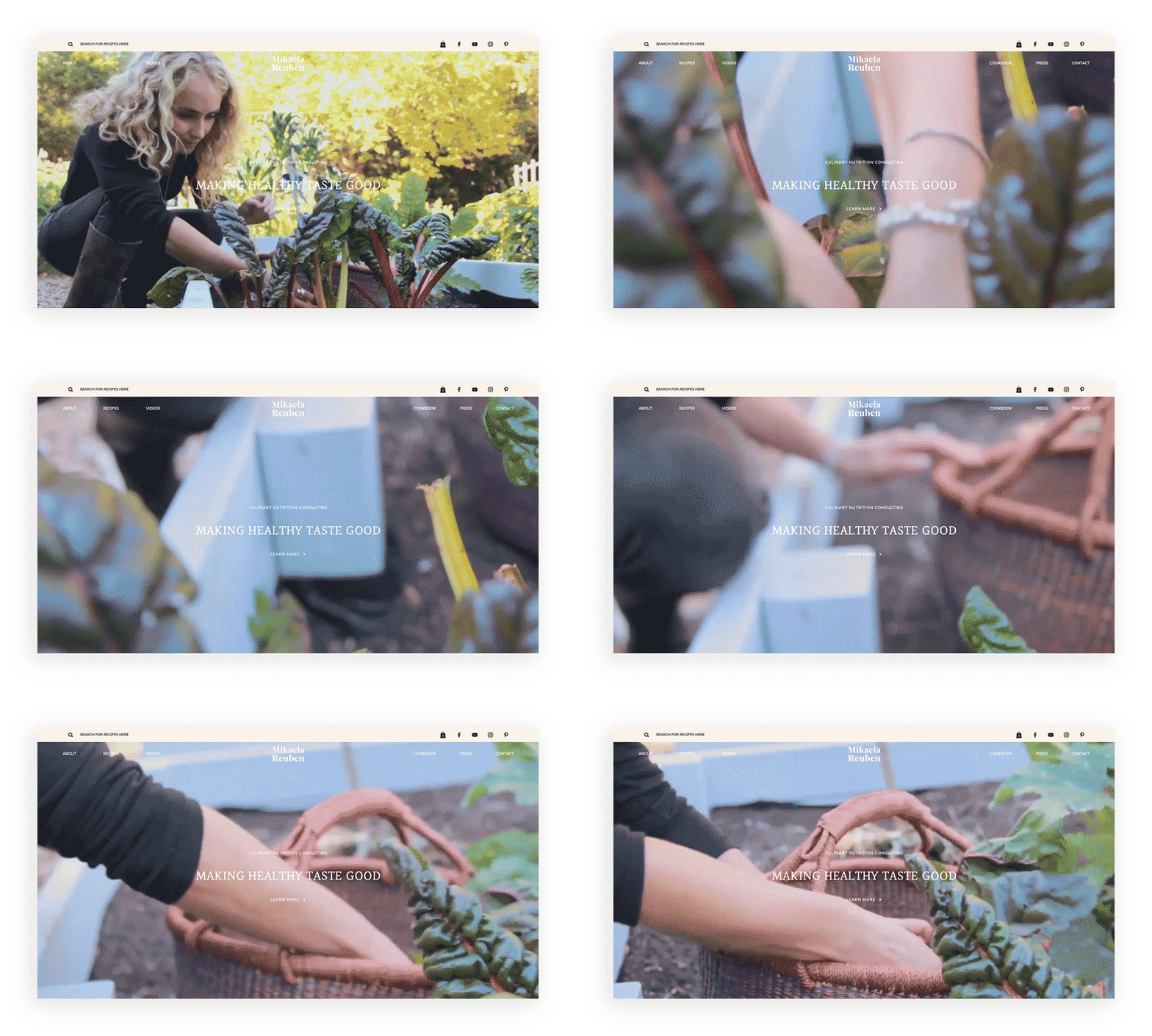
Mikaela Reuben makes a strong first impression with her website header. With a full-bleed GIF of the health counselor picking rhubarb from a garden, the header makes Rueben's holistic approach clear from the get-go. We love that the sticky navigation bar has a white font without a background when visitors are at the top of the page, but it changes to one with a translucent, off-white background and black text when they scroll down. A search bar further enhances the user experience, providing easy access to the bounty of recipes Rueben offers up free of charge.

15. Ivy Chen: Best parallax scrolling
The three-dimensional qualities of parallax scrolling makes viewers feel as if they are discovering hidden content, providing an engaging experience from start to finish. Ivy Chen's unconventional use of the effect is particularly alluring. She uses the effect to encapsulate her design process: A sketch appears first, then the finished garment layers on top, and finally, a photo of a model slides underneath the garment. Such a sophisticated design choice shows how clever and talented she is as not only a fashion designer but also as an illustrator and a graphic designer. Perfect web inspiration in action.

16. Cami Ferreol: Best website footer
Don't overlook the footer just because it's the last thing people see on a website. Cami Ferreol proves just how strong an impression a great website footer can make. Signing off with a postcard-like design, the creative strategist thanks website visitors, leaving her contact details and a recommended music playlist. Finally, Ferreol stamps the end of her site with a headshot and logo, earning her major points for personal branding.

17. Chico Santos: Best website layout
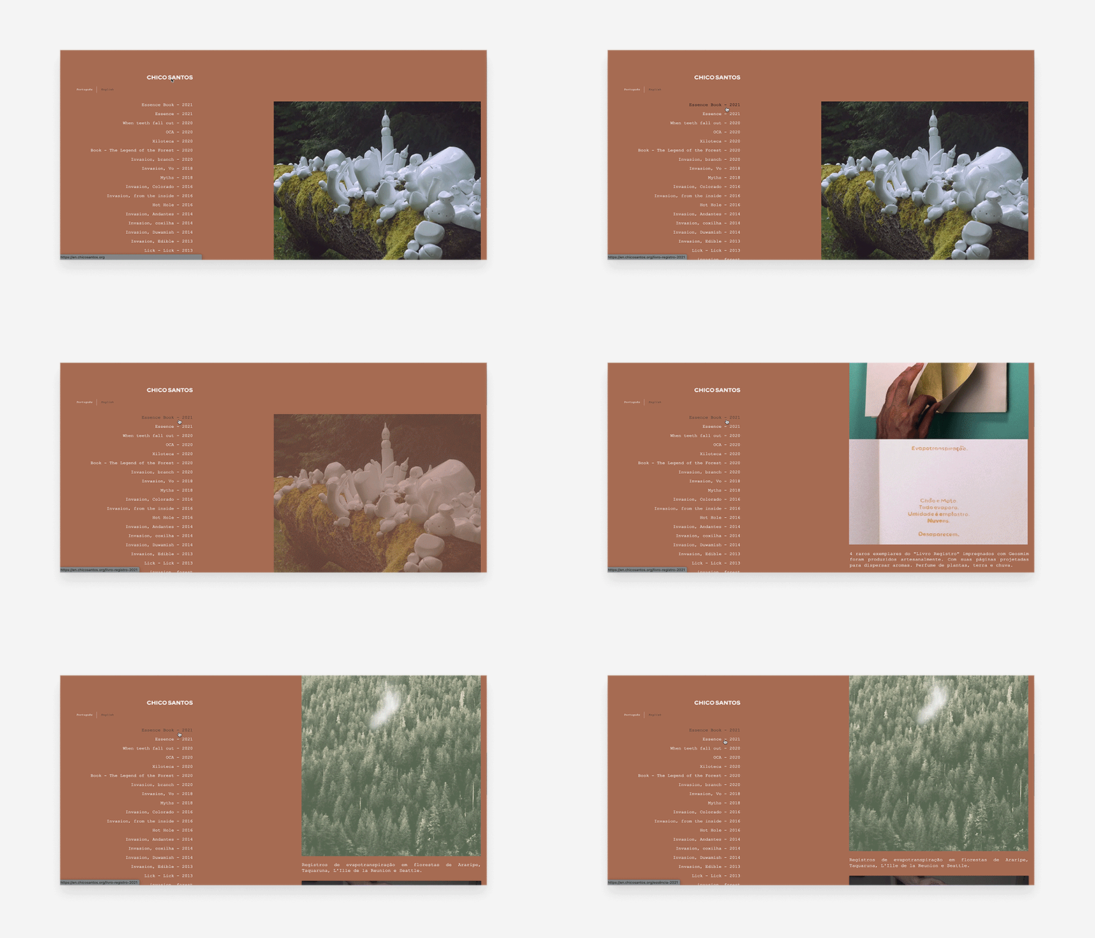
Chico Santos' website layout is as original as it is user friendly. On the left of the page, Santos' lists their projects in reverse-chronological order. The list functions as a navigation bar so that, when a guest clicks on a project, it appears on the right. "It's very simple and uncomplicated," said Rabin. "I like the way one side is sticky and the other one scrolls, because it's a nice way to keep you oriented while you scroll through images. It's a smart solution."
Tip: If you struggle with website layout, utilize these website templates to help you create your website seamlessly.

18. Ellen Von Wiegand: Best lightbox
Even the best websites need a well-designed lightbox, and Ellen Von Wiegand's artist website provides a wonderful example. Because the lightbox design is consistent with the rest of the website, it doesn't bother visitors when it pops on-screen. Featuring a discount and the promise of exclusive offers, the form incentivizes the reader to enter their email address before they hit the exit button.

19. Nathalie Lete: Best splash page
Using the extra website real estate to greet visitors, Lete’s splash page on her illustrator website provides an intriguing preview of her talents. As an artist, she nailed her branding, incorporating a sketchbook page into the background to bolster her professional identity. At the bare minimum, it's just a cute website, matching the style of the rest of her art.

20. Scarf Aid: Best blog design
This year, we’d be remiss if we didn’t acknowledge Scarf Aid’s blog design among our best website designs. Providing creative relief from the stress of the coronavirus pandemic, “Busy Bee Blogger” features a new silk scarf with each post, providing a poetic context for her daily journal entries. The simple blog layout features the most recently published first, while providing links to each series in the navigation menu.

21. Sketch Haven: Best use of movement
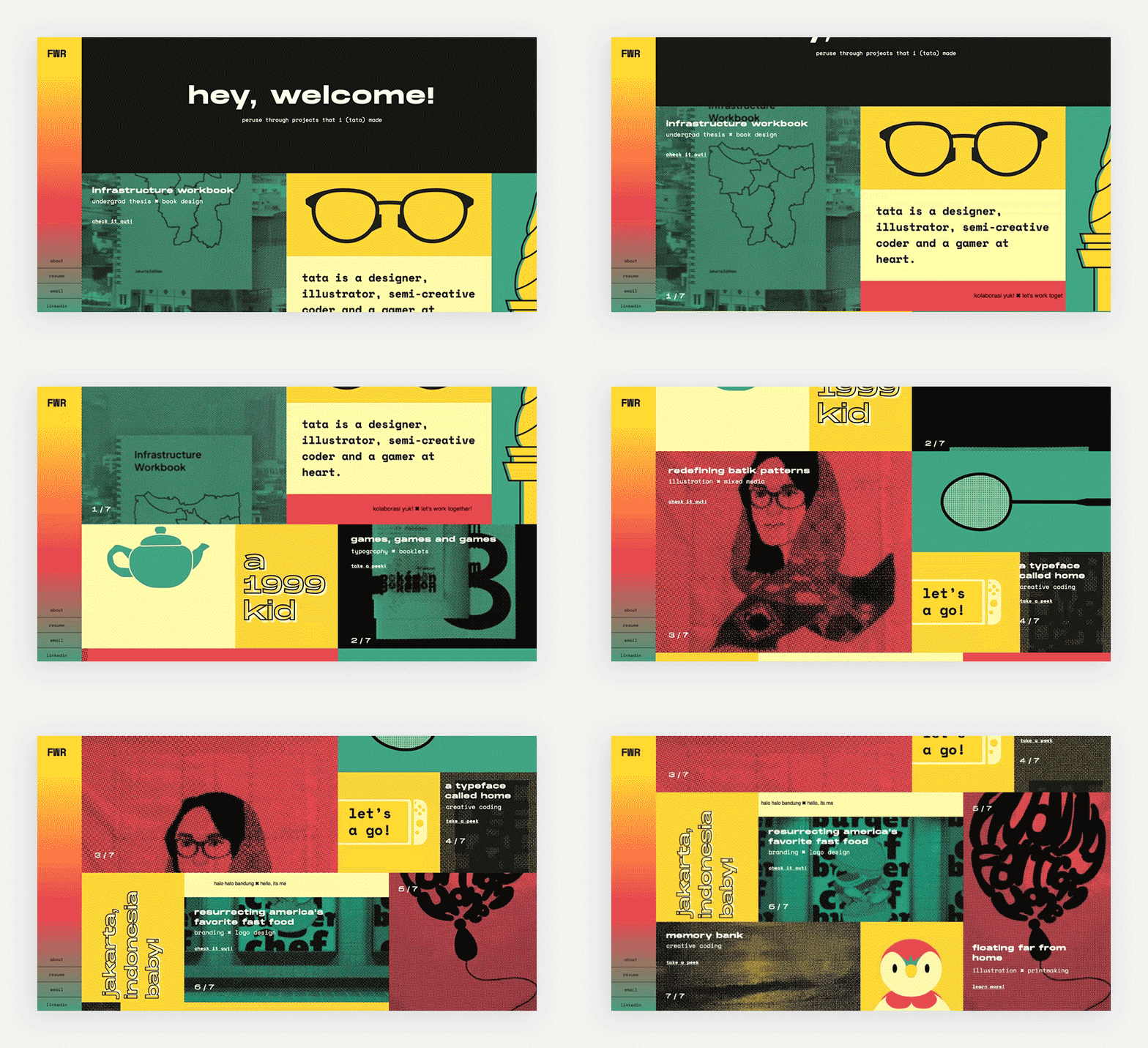
Using animation on a website can be tricky territory. As we can see from designer and illustrator Tata Resko’s website, implementing animation in small doses can create a visual flow for visitors that’s dynamic and engaging. From the scrolling banner messages to the rotating buttons, the moving elements aren't just fun to look at—they also guide a guest's interactions on the site.

22. Tach Clothing: Best online store
We chose Tach Clothing for our best online store because they prove how a beautiful website design can facilitate an ideal shopping experience for users, while still be a perfect example of inspirational web design. The minimalist design allows the fantastic photography to shine and makes navigation simple. The fact that a second product photo shows when a user hovers over an item makes for a pleasant and convenient shopping experience.

23. Defne Kaynak: Best website background
The best website backgrounds set the perfect tone for the rest of the site’s design. In Defne Kaynak’s case, that tone is calm, tasteful and out of the ordinary, providing an ideal setting for her online portfolio. The nebulous design compliments the large text, solid hues and sharp shapes that make up her homepage’s content.

24. Fei Luo: Best photography website
When your photographs are this good, there’s no better way to show them off than with a fullscreen slideshow. Shanghai-based photographer Fei Luo does just that, putting her best works front and center on the homepage of her photography website. This helps to draw attention and demonstrate her skills and style right off the bat.

25. In Print Art Book Fair: Best FAQ Page
In Print Art Book Fair has one of the best website designs on this list, with an exemplary FAQ page. Providing visitors with answers to common questions, the FAQ page reveals important details about applying and participating in the annual event.
The Jerusalem-based fair for artists, book publishers and printmakers also does a great job at localizing content, splitting the FAQ page between two languages. A spacious footer and prominent menu give visitors easy access to more information from In Print Art Book Fair, such as an open call application, social media profiles and archives from past events.

26. Ryan Haskins: Best trendsetter
Graphic designer Ryan Haskins gave his brutalist website a lo-fi treatment, demonstrating his confidence and cultural awareness. "Everything is so loud and trashy, which is very trendy," said Rabin. She loves his use of Wix's Pro Gallery to make his New York Times clips rotate, then stop when the cursor hovers over them. The clashing colors and Powerpoint-esque animations would be grating if utilized by an amateur, but Haskins effectively uses them to emphasize his bold and playful brand personality.

27. Mariela Mezquita: Best contact page
Mariela Mezquita's contact us page is just as sweet as the rest of her website. The round corners on the input fields, playful typography and cheeky tone create an approachable vibe that welcomes in strangers. “I really love the use of movement with the GIF and the use of color in the fields," said Rabin. "It makes it look like a game.”
Whereas experts would typically encourage you to limit web forms to only ask for the bare minimum, the fact that Mezquita has eight fields in her contact form shows her interest in getting to know all her potential customers. The non-mandatory pronoun field is especially thoughtful, as it shows she wants to make all her customers comfortable.

28. The Robin Collective: Best website color scheme
Web design trends come and go, and this year we’re seeing extremes in both minimalist and maximalist directions. The Robin Collective perfects the latter, earning its place among the best websites with this spunky color scheme.
Capturing the attention of visitors with a sunshine-yellow background above the fold and bursts of pink and blue throughout, The Robin Collective demonstrates how an effective color scheme can draw people in and immediately set the tone. Not everyone can pull off such a daring design, but The Robin Collective's use of color proves its status as an out-of-the-box agency.

29. Wendy Ju: Best minimalist website
It's not easy to make a minimalist website with a muted color scheme exciting, but Wendy Ju did just that. She sets the bar high with a subtle but clever animation in the header, but her creativity abounds. We love that the logo influences the site design and that she uses thin lines as a motif.

30. Sharon Radisch: Best homepage design
Sharon Radisch's chic homepage design shows how much of an impact a site designer can make with a simple layout. Black and white photos dominate the page, and the few color photos add luscious pops of red. Splashed across a wide-cropped photo in all caps, the artist's name looks significant and makes sure visitors will never forget it. When making homepages clean, high resolution photos can help tell a story and make an impact.

31. Nedavius: Best Gen Z design
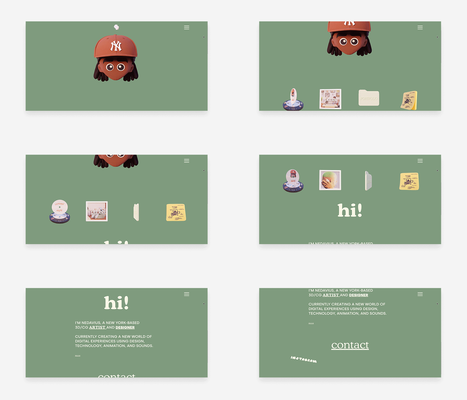
If we could only use one word to describe Nedavius's site, it would be goofy. And yet, the site's goofiness doesn't give you reason to take him less seriously. Rather, it demonstrates his capacity to connect with Gen Zers, who value humor and authenticity.
The artist's blinking avatar sits above four 3D designs that visitors can click through to explore. His use of cushy typography (such as the gummy-bear-esque font he uses to represent his social profiles) and a mossy green background conveys a softness that welcomes in even the most socially awkward Gen Zer. You can read more in our in-depth Nedavius interview to hear more of his web design inspiration process.

For more web design inspiration, check out these top actor websites.
Web design best practices
Now that you’re inspired by the best websites out there, keep those design ideas in mind as you create your own. These suggestions can help you get started and maybe get you featured on a list like this one day:
Start with a strong brand identity. Your website should reflect your brand's personality and values. This means using consistent colors, fonts, and imagery throughout your site.
Make sure your website is easy to use. Visitors should be able to find what they're looking for quickly and easily. Use clear navigation and simple layouts and avoid long, rambling text blocks.
Use high-quality images and videos. Visual content is a great way to capture attention and engage visitors. Make sure your images and videos are high-resolution and relevant to your content. You can also use animation and motion graphics to add visual interest to your website.
Use whitespace effectively. Whitespace can help to make your website look more organized and inviting. Don't be afraid to leave some space around your content. You can also use a dark mode option for visitors who prefer a more minimalist look.
Use responsive design. Your website should look good on all devices, from desktop computers to smartphones. Use responsive design so that your site will automatically adjust to the size of the screen it's being viewed on. Get creating your site with responsive AI with Wix Studio.
Keep your website up-to-date and create engaging content. Make sure your website is always updated with the latest information to keep visitors coming back. It's also a good idea to create content that engages your audience with interactive elements, such as polls, quizzes and calculators. Try using storytelling and humor to connect with visitors on an emotional level.
Where to find web design inspiration
There are many places to find website design inspiration, both online and offline. Here are a few ideas:
Online web design inspiration
Website design galleries: There are many websites that showcase beautiful and inspiring website designs. You can also look for specific lists of websites in your chosen niche. For example, if you're opening a store online, you can explore these best eCommerce websites.
Social media: Social media platforms like Pinterest, Instagram and Twitter are great for finding website design inspiration. You can search for specific keywords or follow designers and studios that you admire.
Web design blogs: Many web design blogs regularly publish articles and tutorials with inspiring website designs.
Offline web design inspiration
Books and magazines: There are many books and magazines that focus on web design and inspiration.
Museums and galleries: Museums and galleries can be a great source of inspiration for website design. Look for exhibits that feature typography, photography or other forms of visual art.
Nature: Getting outdoors can actually help you design your website, too. Look for patterns, textures and colors in the natural world that you can incorporate into your designs.
No matter where you look for inspiration, it's important to remember that the best website designs are both creative and functional. They should be visually appealing and easy to use. Keep your target audience in mind when designing your website and choose elements that will appeal to them.
Web design inspiration sources
Wix website examples
Draw web design inspiration for your own site from these Wix website examples. Whether you create your site from templates, or scratch, there are Wix web design inspiration examples here for everyone.
Wix Studio website examples
Turn your web design inspiration into fuel with these website examples from Wix Studio - the platform built for agencies and professionals.
Wix templates
With over 800+ professionally designed website templates to choose from, the Wix template bank is a great place to draw web design inspiration from.
Dribble
As a platform where designers showcase their creative work, Dribble serves as a community for sharing and discovering design inspiration, showcasing portfolios and fostering collaboration within the design industry.
Behance
As an online platform for creative professionals to showcase and discover artistic work, Behance enables designers, artists and creators to present their portfolios, connect with peers, and find web design inspiration.
Best websites inspiration and design FAQ
What are some tips for finding the best websites?
When you are searching for the best websites, be specific in your search terms. The more specific you are, the more likely you are to find websites that are relevant to your interests. You can also use multiple search engines to help you find a wider variety of websites. Also, don't be afraid to try out different websites to see which ones you like the best.